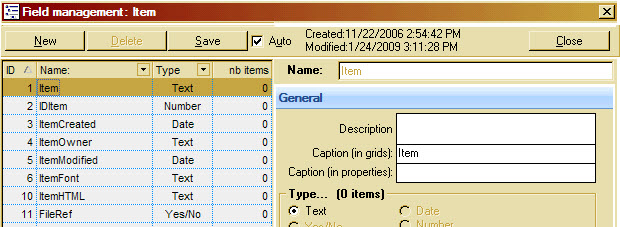
The "Field management" dialog has alway seemed unintuitive to me. I click "way down there" for "New" , then my eyes look "way up there" to the name field, then they focus once again "way down there" to save/close, etc.
I cobbled together a screenshot of what it could look like, (moving the existing stuff from the bottom to the top)--that's what I'd like to see.

Comments