Good news IQ users,
Hoist is coming to IQWorld... with a twist (what did you expect... )
Hoist is a feature where one can focus on a branch of a tree, and toggle back to the full tree. IQ has many outline trees (1 per grid), so it is already easier to work than many other apps with a single outline tree. Users could simulate Hoisting in a number of ways (using item tagging for example), but it was cumbersome.
I've now completed a full-featured hoisting system for IQ. As expected, users can now:
- Select an item (i.e. a branch) and do a Hoisting. The display will filter to show only that branch
- If already Hoisting, you can Hoist even deeper in the tree
- Grid>>Hoist will restore the full grid display
The IQ twist is as follows:
- You can select multiple items to Hoist. (many apps support a single item hoist)
- There are 2 Hoist buttons:
- Grid>>Hoist Selected Items: does exactly that. Select items and Hoist. Ctrl+Shift+H is the default shortcut
- Grid>>Hoist: toggles between Hoisted and non-Hoisted display. That way, if you Hoist a few items, and want to toggle back to view the whole picture, you can go back to the Hoisted display without re-selecting your items. Ctrl+H is the default shortcut
- Items added while Hoisting, become part of the Hoist
- If Grid>>Context Parents is checked, the immediate parent will be shown. Useful to remember the context
- Hoist can also function as "Filter Selected". Select any items, even TLIs and Hoist will filter for just those.
- Hoist state is saved (re-opening the grid will restore correct Hoist display)
- Hoisted display is accessible to ODBC applications (so you can, for example, select a bunch of contacts, Hoist them, and then use Word, Excel (or even IQ) to view these (Word can mail-merge, Excel can display these items, etc). The query name is YourGridNameHoist.
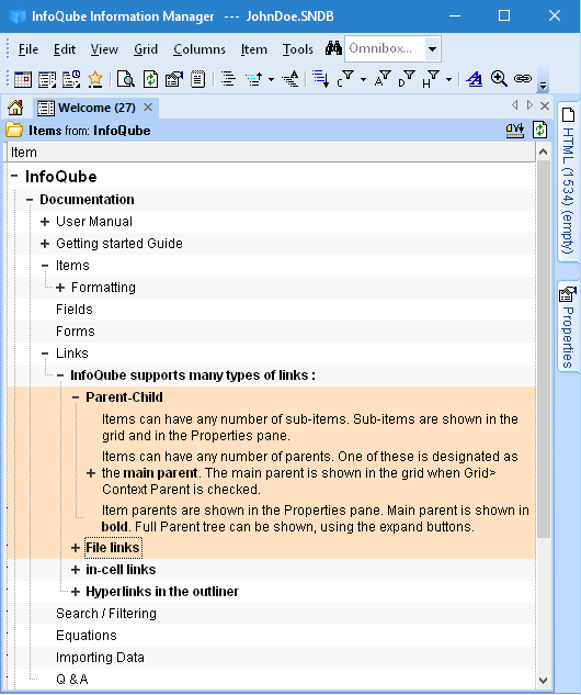
So, starting from the Welcome Grid, suppose you wanted to focus on Links. Select the items from the whole grid:

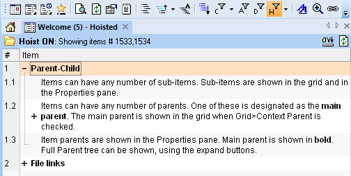
Do Grid>>Hoist Selected Items (or right-click) to get this display:

Click on the Hoist button (a funnel with the letter H) to toggle between the two displays.
This feature will, I hope make things much easier for you, IQUsers. Thanks for your patience.
Comments