Submitted by Tom on 2017/10/16 08:25
Now that IQ is looking really great, as well as being really great :-)  I want to write about the theme colour.
(Just in case: in the past there were multiple themes -- I believe there's only one now?)
 
I do like the blue-orange theme, but there's a problem with it:
it clashes badly with almost all the default item highlight colours. In fact that shade of blue (especially as used on tabs, and the darker one) clashes with nearly every other colour...
 
You may have gotten used to the clash of the colours --
have a look at these:
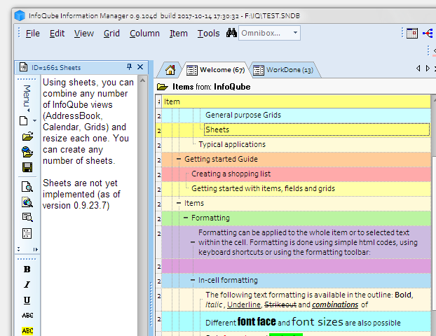


all the highlighting colours work fine with each other, but, as said, not with the blue UI
 
 
Now look at the same with the blue cropped -- now surrounded by grey:
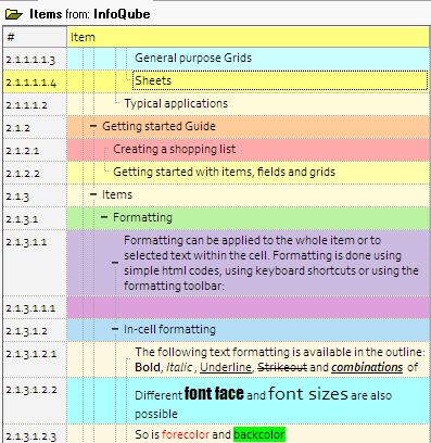


They dont clash with the grey:
 
So, a suggestion --
how about a (light) grey theme instead of the default one?
--
it would still work with the orange highlighting of icons etc imo
 

Comments

Hi Tom,
 
It is possible, but how about if more pastel colors were used for highlighting ?
Such as:


Pierre_Admin
IQ Designer
 

Tom

2017/10/17 05:37

In reply to by Pierre_Admin

Pierre,
would you be able to give me a list of the "&HE0BBCC" type name (sry, cant remember what that's called).
I can try them out.
 
EDIT//
did a quick replace on the colours in previous shot using your palette there Pierre


it does work a lot better -- has the possible disadvantage that highlighting isn't as bold.
But yes, still probably preferable to me.
 

I think the idea of "clashing" colors is somewhat subjective, but I do agree it'd be nice to have options for the color scheme.
 
I like to use a gray theme because it makes other colors stand out, which is the purpose of highlighting.  The impact of blue highlighting is lessened a little if the surrounding theme is the same blue. 
 
Of course, gray highlighting will tend to blend with a gray background but for my use that's actually an advantage since I use gray highlighting to mean "NA" or "Void".
 
Wayne
 
[Edited to sound less like I'm undercutting Tom's request, which wasn't my intent]

Tom

2017/10/17 05:47

In reply to by WayneK

Hi Wayne,
just happy to get the idea out there, and to get feedback:
 
Yes, a share of all this is subjective. There is a certain amount of 'science' to colours -- but not being the science expert, I cant say much there.
 
FWIW I am a very visual person, I work with illustration and have worked with colour quite a bit in the last few years.
So maybe I'm more fussy about it too. Or notice it more.
 
Likewise I use grey for item 'done' etc.
 
Also, as Pierre suggested above, a different default palette would work better with the current theme.
I'd still like the option of a nice light grey theme myself -- of course Pierre I dont want you spending time on icing rather than the important stuff, but started the thread in the context of all the visual / UI improvements lately.

Armando

2017/10/17 11:14

In reply to by Tom

I also use colors extensively in IQ. Changing the palette might be an option*, but I agree that a grey theme would ease color combination/harmony and add clarity to the interface.
Apart from colors : lines thickness, space between some elements (am thinking about the add item dialog especially, but also other parts I don't have the time analyse right now) could also eventually be slightly adjusted.
That said, the current theme is OK to me, and the recent changes definitely make it more readable and pleasing!
 
(*Would probably keep my own though... I'm used to it, after all those years : specific colors have specific meaning...)

Armando

2017/10/18 20:01

In reply to by Armando

For what it's worth : looking at available themes for Office 2010 yesterday (only 3 themes...), I realized I set mine a many years ago to grey/silver exactly for the reason Tom mentioned.
I retried blue and black, and everything is less "readable". (Arguably though, the black theme might be good in a dark environment.)

 Re: clashing colors I'm going to be bringing my interior designer into this discussion.  One comment she had was to add a rug to really help bring the grid together.


WayneK

2017/10/17 21:07

In reply to by David_H

Worked for the Dude.
 
Wayne
 

David_H

2017/10/17 21:35

In reply to by WayneK

[quote=WayneK]
Worked for the Dude.
 
Wayne
 
[/quote]