Submitted by LeftEccoForIQ on 2019/01/10 04:21
I suggested something like this before, but only now realized that a lack of this feature could actually cause data loss.
 
The extent of the problem depends on the width of a grid's 'window'. For grids shown in a narrower window, less of the items' text is shown in the grid. In the worst case, if you have blank lines at the beginning of an item's text, this can lead to the item being shown as completely empty and thus becoming visually indistinguishable from a dispensable blank item. When cleaning up and deleting blanks, data can be lost inadvertently. Here are two screenshots to illustrate:
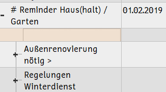
 
 
 Note the selected item appearing completely blank...

 
 
When in fact (as becomes apparent in edit mode) it contains lots of text...
 
 
I really feel IQ should somehow indicate that items contain additional text not shown in the grid and / or ask for confirmation when deleting such items.
 
Cheers

Comments

Hi !
 
I don't understand why the cell shows a blank line. Should it not wordwrap the content ? It does here when I try it... 
Turning off Wordwrap also hides the blank lines and show the content
 
So, if possible, please explain how you "achieved" that.
 
Pierre_Admin
IQ Designer
 

LeftEccoForIQ

2019/01/16 05:13

In reply to by Pierre_Admin

Okay, I figured it out. The whole problem only pertains to word wrap-enabled columns since, as you pointed out, with word wrap disabled, blank lines at the start of items are filtered out and the user will expect items to contain additional text that isn't currently visible.
 
So what happens with word wrap enabled and items having more or less text?
 
This convenient website can generate numbers, e.g. from 1-1000, for easy copying to the clipboard (each number is put on a new line). If you paste this long list of numbers into pretty much any grid, you will see that not all 1000 lines are displayed in the grid. In fact, unless you have multiple screens to enable an enourmous column width, you will probably only see the very first line, i.e. all you will see in the grid is '1'. Now if you edit the item and add a blank line at the beginning, you will only see a blank line in the grid, which is probably the biggest issue. Rather surprisingly, If we only take the numbers from 1-10, IQ will display the entire text unless column width is set to be very narrow.
 
Additionally, if I remove all carriage return and new line characters from the list of numbers 1-1000 to get a continuous string of digits, IQ will display up to number 871 with the column width set in my main editing grid (font size seems to be irrelevant) but not all the way up to 1000. Hence, clearly, IQ considers column width in relation to both the character and line count of an item when deciding what percentage of the item text to display. However, when playing with column width and looking at the '123456789101112...' item, there is a kind of chop-off point where suddenly only a single line is displayed and when widening the column, it jumps back to 871. Possibly there would be another 'jump' when making the column even wider. Reducing the length of the digit string to 950 didn't change the percentage of text that is displayed, i.e. it's still up to 871, so this seems to be different from items that contain many (or any?) line breaks.
 
In conclusion, I feel that
1. it doesn't make a lot of sense that a smaller percentage of an item with more line breaks is shown, so IQ's internal scaling seems to be a little off in that regard.
2. blank lines at the beginning of an item's text should probably also be filtered with word wrap enabled to avoid items with text being mistaken for blank filler items.
3. (just repeating this here to be complete) it would be useful, with word wrap enabled, to have a visual clue that some item text is currently not being shown in the grid and / or to ask for confirmation when deleting such an item if at all possible.
 
Phew!