Submitted by Pierre_Admin on 2017/09/22 18:27
Hi IQ Users !
 
Coming in the next version (v0.9.104) : 
  • New: View > Layout > Workspace Tabs command (Alt + Ctrl + W) switches between 5 tab layouts: Normal, Fit, Compressed, Multi-line and Left side. Setting for the maximum tab width when on the left side
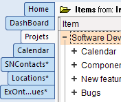

     
  • New: Improved Workspace tabs looks. Google Chrome-like
  • New: Tab Close button now shows on mouse-over only (making for smaller workspace tabs)


  • New: Option to hide icons on workspace tabs
  • New: Grid: Load hidden items in background
  • New: Grid: When the Source / Group bar is not shown, clicking on the column header toggles between selecting all items and selection the current item
  • New: Field Management: Improved performance for large databases. Nb Items column now updates only visible fields and if the column is more than 10 pixels. Close column to prevent item count update
  • New: Properties pane: Dates that are shown in the Calendar are now shown in bold
  • New: HTML Export: Improved UI (in preparation for Heading style export)
  • Change: Grid: Reduced clutter on the label above the grid. Click on the folder icon to show / hide the source bar
  • Fixed: Grid: Item count was not shown when the grid was in a pane
  • Fixed: Panes: When closing / hiding a pane, focus is moved to the main window, but it did not trigger a focused item change event, so Properties and HTML pane were not showing the corrent item
  • Fixed: HTML Export: After an Email merge, the main IQ window was locked
  • Fixed: HTML Export: Back color and item fonts were not the same as the grid
  • Fixed: HTML pane: Cleanup HTML code did not work for embedded DIVs (DIVs inside a DIV)
I'll update this post as new features are added and bugs fixed !
 
Pierre_Admin

Comments

Very excited about the loading of hidden items :)
 
Can we have the workspace tabs display as an option? The new one being the default of course.

Pierre_Admin

2017/09/24 21:37

In reply to by ethanrox

[quote=ethanrox]
Can we have the workspace tabs display as an option? The new one being the default of course.
[/quote]
You mean that you prefer the previous look ?
 
Pierre_Admin
IQ Designer
 

Armando

2017/09/25 02:30

In reply to by Pierre_Admin

[quote=Pierre_Admin]
[quote=ethanrox]
Can we have the workspace tabs display as an option? The new one being the default of course.
[/quote]
You mean that you prefer the previous look ?
 
Pierre_Admin
IQ Designer
 
[/quote]
 
I'm not answering for ethanrox, of course, but those tabs seem larger than the current one.
I think it would be good to be able to keep the slim ones -- for people with small screens, every mm or so counts...

Pierre_Admin

2017/09/25 13:50

In reply to by Armando

I'll add an option to choose from. The new look was also about the color change.
 
Additionnaly, I'll see if I can add an option for limiting the tab widths, to be able to fit more on the same screen
 
[edit] After measurement, the tab density is nearly identical to the old "square" one. Perhaps 1 pixel wider per tab. [/edit]
 
Pierre_Admin
IQ Designer
 

ethanrox

2017/09/25 08:23

In reply to by Pierre_Admin

Yes, I prefer the old ones.
Additionally, if we choose more browser-like look, I would prefer rounded corners and more Mozilla Firefox styling.

 I can live with tabs of any of those designs, but one thing that is important to me is not truncating the titles.  Hiopefully that will stay as it is now.  Or at least if there is a point at which they get truncated, I have not exceeded it.

Pierre_Admin

2017/09/25 23:13

In reply to by David_H

Multi-row tabs perhaps ?
Another options is showing the ellipsis in the middle (i.e. ThisIsATabCaption would be shown as ThisIs...Caption)
 
Pierre_Admin
IQ Designer
 

Jon

2017/09/26 04:58

In reply to by Pierre_Admin

 No multi row for me. It will reduce my work area. The current title arrangement works fine. The ellipses idea is a good compromise. Or, how about offering this as selectable display options?
 
Jon
 
--
Sony Vaio Z, Intel Core i7, 8 GB RAM, 800 GB SSD
Windows 7 Professional 64 bit

 fix black grid background in new Grid created in new blank IQbase?
 
I notice that options 1.2.4 and 1.2.5 set the "grid items background color".  Not sure how this relates to the "Grid Background Color" option in Manage Grids > Options.

 All I care about is right now I can have pretty long titles and I hope that does not change.  Is there currently a character or size limit for a tab?

Tab improvements look great.  Would be nice to also have tab formatting (background color and font)
 
Wayne
 

Pierre_Admin

2017/10/04 12:31

In reply to by WayneK

[quote=WayneK]
Tab improvements look great.  Would be nice to also have tab formatting (background color and font)
[/quote]
Impossible to have grid specific tab colors, but OneNote style colors (random ?) is possible:
 
 
I don't think that it is clear which tab has the focus though...
 
HTH !
 
Pierre_Admin
IQ Designer
 

WayneK

2017/10/04 13:50

In reply to by Pierre_Admin

To my mind, the purpose of having colors would be to train your mind to associate the color with the tab and be able to locate it more quickly without reading the tab titles.  Random colors wouldn't help with that.  On the other hand, colors would help the tab row stand out more.  To my eye, it tends to blend in with its surroundings.  So I'd vote yes. 
 
The problem, for me, is having too many tabs open and losing track of what I'm looking for.  My primary solution is to keep the most-used tabs grouped to the left.  You an also supplement this with tab groups.
 
The best solution might be navigating to your home tab and keeping a list of grid links there, where they can be color-coded and organized however you want.  This also bypasses the problem of looking for a grid that's not open.  I try to train myself to use this method but the little extra step of going to the home tab makes me inclined to skip it and directly look for the tab
 
Wayne
 

Pierre_Admin

2017/10/04 15:03

In reply to by WayneK

[quote=WayneK]
To my mind, the purpose of having colors would be to train your mind to associate the color with the tab and be able to locate it more quickly without reading the tab titles.  Random colors wouldn't help with that.  On the other hand, colors would help the tab row stand out more.  To my eye, it tends to blend in with its surroundings.  So I'd vote yes. 
 
The problem, for me, is having too many tabs open and losing track of what I'm looking for.  My primary solution is to keep the most-used tabs grouped to the left.  You an also supplement this with tab groups.
 
The best solution might be navigating to your home tab and keeping a list of grid links there, where they can be color-coded and organized however you want.  This also bypasses the problem of looking for a grid that's not open.  I try to train myself to use this method but the little extra step of going to the home tab makes me inclined to skip it and directly look for the tab
[/quote]
  • re Grid tab colors: Agreed
  • re Too many tabs: I tend to use the Recent Grid menu a lot. I've also started created dashboards, which contain a a set of grids, all nicely arranged. My main PC has a 15in HD display and it works well. Larger screen would work too. I occasionally use tab groups too.
  • re Home page: Works well too, and I know David is a big fan. I don't use it right now though... Alt + 1 is the fastest way to get to the Home page and back
 
Pierre_Admin
IQ Designer