Submitted by cicerosc on 2009/10/14 16:33
I am relatively new on the forums and I see there has been a lot of discussion in the past about the lack of a "folder view" as in Ecco, but I cannot determine whether this suggestion has been determined to be "impossible" or whether it is still planned for the future.
 
What I am really looking for is the ability to keep a list of categories along the left side of the screen and to be able to click on those categories to show different views of the data.  I can almost foresee using the properties pane to do that but it doesn't seem to lend itself to that and (I know this is minor) I can't get that view over on the left of the screen so that has the visual appearance of being the controlling entry point to the view.
 
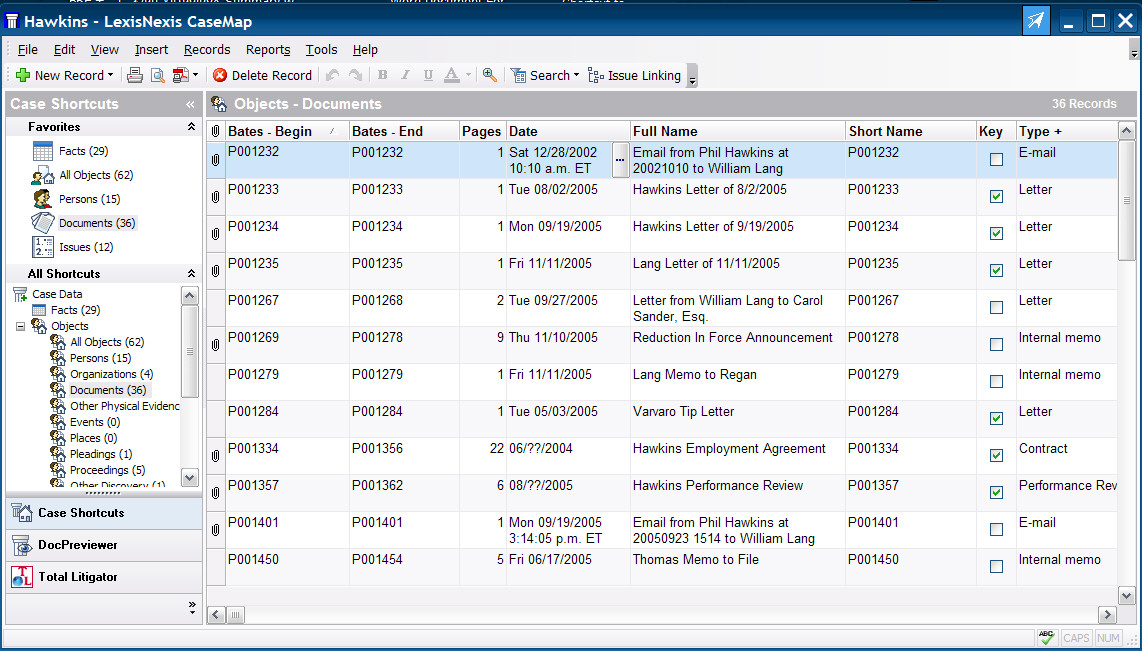
To illustrate the effect I am trying to achieve, below is a sample screen from the "casemap" software (which seems to operate similarly to Infoqube).  The main thing I am looking for is the "Case Shortcuts" screen on the left, which seems pretty equivalent to the old Ecco Folder View.
 
thanks for any info you can give on your plans  ---
 

Comments

I see no one has commented on my question - I apologize if I've brought up a sore subject!

Tom

2009/10/20 14:32

In reply to by Anonymous

I'm not familiar with Ecco myself but reading your post and looking at the screenshot* I would say those 'shortcuts' on the left look pretty much like grids to me -
you would have to set them up first (Create grid). How familiar with IQ are you Cicerosc ? (I'm not sure how much I need to explain here..)
 
Ctrl+Shift+O will open a list of grids in the current database.
 
e.g. in my current file I have grids that show
linked files,
time tracking.
projects
inbox
etc. etc.
 
doesnt seem too different from the examples above?
also, for the linked files I have a few different grids I regularly use [showing linked files] that show different columns and that are pre-sorted in different ways & maybe pre-filtered as well
 
As said I'm not familiar with ecco so I maybe missing something - maybe someone who is familiar with ecco will comment also
 
* btw, any chance you could reduce the size of the screenshot - it's size makes the text very difficult to read on a small to average screen - text goes off the white blackground

Tom

2009/10/20 14:38

In reply to by Anonymous

Rereading your post I would agree that the ability to have a list of grids on the left would be nice. The default install shows the grids on the left but the text reads top to bottom of screen and doesnt show many grids cause it runs out of space fairly quickly
 
A simple list view would be good (I dont think this possible - or is it??)
 
inbox
scratch
files
timetracking
projects
etc
etc

Anonymous

2009/10/20 17:31

In reply to by Tom

Thanks for your reply. I see that the list of grids running vertically down the left does approximate what I am referring to, but as you point out the vertical orientation limits what you can see at one time. Also, the fact that clicking on one tab adds a new view, rather than replacing the current view (as it does in Ecco) seems to be a limiting factor to using those tabs to navigate the data. I would think there might be a way to toggle the action from "Adding a new tab" to "Replacing the current tab" but I don't see that yet, if it's there. So I guess what I'm really missing is the ability to "dock" the "List of Grids" from the "Manage Grids" window along the left side of the screen. If that were doable, and if it were possible to click on the individual grids in the list to bring up that grid (like you can do by clicking in the "Available Fields" list of the "Properties" panel, you would then have much the same ability to manipulate the views that is standard in Ecco. One again, sorry to refer to Ecco as if it is the ultimate standard or something....

cicerosc

2009/10/20 20:52

In reply to by KeithB

KeithB
 
Thanks for referring me to that thread.  It was both enlightening and disheartening.  I can see this program being so close to what I need (and, for example, so close to what the Casemap program is in the screen shot I posted).  But attempting to follow that description just gives me a major headache -- and I pride myself on being an advanced Ecco use and very computer -savy. 
 
The thought of figuring out how to do something that appears basic, and then explaining it to any of my staff just fills me with angst.  (OK that's a little exaggerated but not much :-) 
 
I bought a license and I'll continue to follow development with my fingers crossed that the user interface will continue to improve.
 
Thanks again!


Pierre_Admin

2009/10/20 22:53

In reply to by Anonymous

Sorry for the delay in responding to this post. I'm very busy this week and will be able to answer correctly next week.
 

Pierre said he'd soon answer, but maybe I can offer my perspective in the mean time.
 
It seems to me that a grid list like what Tom said in one of the earlier posts would do one aspect of what you're looking for:
 
[quote]
Ctrl+Shift+O will open a list of grids in the current database.
 
e.g. in my current file I have grids that show
linked files,
time tracking.
projects
inbox
etc. etc.
[/quote]
 
 
When I press Ctrl+Shift+O I get this in my GUI :
 
 
Basically : a list of views.
 
Yes, these will open in new tabs -- they're usually different enough (in terms of column, etc.) to appear independently from one another. This is actually very useful and essential in my own work.
 
 
I think that the missing elements here are : hierarchical view of grids (ie : to be able to represent grids in a tree) + the famous "named filters" + being able to dock the grid menu to the side of the window (but with horizontal names tiled vertically).
 
What are "named filters"? Well, each grid's filters can be changed as one work, but several users complained that it's a cumbersome process to always have to re-enter various filters all over again when one wants different "views" of the data in the same grid. So the idea of a UI device which would allow to memorize certain filter settings in a list and combine them was brought up a while ago : "named filters". These could be compared to outlook views, in a way (but not exactly), or X1 saved searches, or maybe what you're referring to in your first post...
 
In any case, to recapitulate, I think that :
 
1- The grid list
2- Ability to represent grids hierarchically (although I don't care too much for that as I use the "search as you type" functionality to navigate in my grid list)
3- Named filters (Name filters would more intuitively Allow to have several view inside the one grid)
4- and maybe -- for those who want it, but it's a big loss of screen estate, especially on a laptop -- an option do dock the grid menu (as shown in my screen shot : with horizontal names tiled vertically) to the side of the window...
 
Would pretty much cover what you want... No ? What do you think ?


Anonymous

2009/10/21 11:04

In reply to by Armando

Armando: Your recapitulation is dead-on right. Much more succinct than I stated it. And you're right about the loss of screen real-estate, but I'm finding as time goes by most all of my monitors are wide-screen and lend themselves to that format. The ability to QUICKLY switch between views by having those lists docked and available all the time is probably a key reason why CaseMap took that route for its default display, and why it was integrated into Ecco. Also, I apologize that I have not been able to read through the postings in recent months enough to tell whether these issues are possible and in the works, or impossible due to the structure of the program. Let me restate that I am deeply impressed with the progress that has been made with this program and I am earnestly cheering for success. And of course, Pierre, I am sure you are covered over and am happy to receive replies in due course. I am very sympathetic with anyone who has to field constant calls for more and better but only has limited resources to devote to it. Keep up the good work.

David_H

2015/01/19 15:29

In reply to by cicerosc

Haha cicerosc!  I just came back to IQ after about a 5-year sabbatical from it, and this was the first question I asked.  Unfortunately I can't get Pierre to answer.  You can read my thread here, coincidentally I even posted a screenshot almost identical to yours.  www.sqlnotes.net/drupal5/index.php

 Thanks for your comment David. 

Well, it should be obvious to us I guess that Pierre just doesn't see things the way we do on the importance of this feature.  To each his own, and i wish him and the program well in their path and their vision for what the software should be.

 Hi !
 
I'm on holidays right now.
Multi folder views is definitely planned.
The reason why they haven't been implemented yet is that it can be simulated by using multiple grids and I had other features and issues higher priority.
 
Pierre_Admin
 

David_H

2015/01/20 21:11

In reply to by Pierre_Admin

Pierre, I fear you are the quintessential engineer who places little value on the user interface .  We cannot simulate this with multiple grids, if anything having lots of grids is why we need it so badly !  This single feature would make IQ into a completely different program, in one fell swoop it would allow users to categorize grids and information in ways that reflect how many users think about information. 
 
Ironically this discussion is akin to outlining, which IQ does so well.  Yet so many pieces of software such as Outlook are near worthless for task management because they force users into an unmanageable flat structure, with every task at the same level, no ability to outline tasks or break them down into their component structures.

We just want the same thing for grids, to be able to outline them, to categorize them to break information down into a structure that is meaningful for us, as opposed to this huge flat structure of 100 grids, which totally goes against how I think about information.
 
Anyhow, I understand you have to set priorities.  I'm just arguing for why this is so high for me, and why multiple grids don't simulate it for us at all.
 
Thanks

Pierre_Admin

2015/01/20 22:02

In reply to by David_H

Hi David and cicerosc
 
I hear you what you say. I think this is two separate issues.
  1. Multiple folders view in a grid
  2. Hierarchy of grids
Also, on the original navigation question you brought up (Infoqube Navigation) do you know that you can double click on the field in the properties pane to make IQ behave like Zoot ?
 

David_H

2015/01/20 22:55

In reply to by Pierre_Admin

Thanks for the response Pierre!
[quote=Pierre_Admin]
Hi David and cicerosc
 
I hear you what you say. I think this is two separate issues.
  1. Multiple folders view in a grid[/quote]
Yes, I fear I confused things somewhat because I now see that is what cicerosc asked for.  Which I would also like .  Either as he shows it, or using a more conventional view drop-down.  I now also understand why you said multiple grids accomplish the same thing, very sorry.
 
[quote]
  1. Hierarchy of grids[/quote]
Exactly, that is what I am asking for.
 
[quote]Also, on the original navigation question you brought up (Infoqube Navigation) do you know that you can double click on the field in the properties pane to make IQ behave like Zoot?[/quote]
 
Now I'm afraid you've lost me.  I know I can click on certain things in the Property Pane to jump to those items/grids, but have not played with it much.  But I'm not sure how that is like what I showed in Zoot, which I used to show an example of grid hierarchy.  My use of Zoot may not have even been appropriate, I don't even used it, I just grabbed that screenshot because I thought it was showing an example of hierarchical navigation.
 
Thanks

cicerosc

2016/06/07 18:27

In reply to by David_H

 Pierre:
 
I came over from the Ecco group --
 
Could you bump this thread or otherwise point me in the direction of a screen shot showing the folder view capability?
 
thanks!

Pierre_Admin

2016/06/07 21:00

In reply to by cicerosc

Hi,
 
Welcome back !
 
Is this the kind of view you're looking for ?
 
 
Pierre_Admin
IQ Designer
 

David_H

2016/06/08 00:26

In reply to by cicerosc

[quote=cicerosc]
 Pierre:
 
I came over from the Ecco group --
 
Could you bump this thread or otherwise point me in the direction of a screen shot showing the folder view capability?
 
thanks!
[/quote]
Hello Cicerosc!
 
I am not sure how what Pierre posted related to what you are asking for, I may be missing something.
 
Since you've been gone a huge addition has been the Home page.  You can have as many as you want, and structure them how you want.  I keep mine on the left side of the screen so I can quickly navigate through my grids, which I have categorized (see snippet screenshot attached below).  The categorization is strictly visual, the levels below are individual grids.
 
To my knowledge there is not yet any way to instantly call up different views of the SAME grids, BUT:
1. You can now instantly load groups of columns ("load column sets").
2. You can create as many grids with different views as you like.  Since you can now locate them in the Home page/s however you like.  So using your "case shortcuts" as an example, you could create a title as I have in my screenshot and have as many different grids/views under it as you want.
 
IOW, I am able to create a Home page navigation on the left that very closely simulates what you show.  And you can even create as many of them as you want.  For instance, you could literally create a dedicated home page for a complex project, entirely dedicated to the project.


Pierre_Admin

2016/06/08 00:29

In reply to by David_H

[quote=David_H]
To my knowledge there is not yet any way to instantly call up different views of the SAME grids, BUT:
[/quote]
By this you mean ?
 
HTH !
 
Pierre_Admin
IQ Designer
 

David_H

2016/06/08 00:40

In reply to by Pierre_Admin

I mean there is no "saved view" mechanism by which a user can create multiple saved views for a grid and then instantly select between those different saved views (different columns, filters and groupings).  But as I noted...or tried to note (I tried to edit the post to clarify it but it appears I am now locked out of editing the post), the same can be accomplished merely by creating multiple grids, one for each desired view.

cicerosc

2016/06/08 07:43

In reply to by David_H

Thanks Guys.  I am going to re-download and take a new look.
 
I noted this comment from another thread at it is pretty much exactly what  I mean.   The folder view metaphor I am thinking of is pretty much exactly the way I use outlook -  navigation tree on left, then a list of emails in the middle, and then on the right a preview panel that shows the detail of the email.  That's pretty much the same way I use not only Ecco but also my file explorer too (I use Freecommander).  So thanks for pointing out the Outlook analogy. 
 

Re: 2.08 The Home Page