Submitted by Pierre_Admin on 2017/10/06 16:40
Hi IQ Users !
 
Version v0.9.104 is now available: 
  • New: View > Layout > Workspace Tabs command (Alt + Ctrl + W) switches between 5 tab layouts: Normal, Fit, Compressed, Multi-line and Left side. Setting for the maximum tab width when on the left side


  • New: Improved Workspace tabs looks. Google Chrome-like
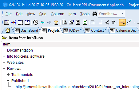


  • New: Option to hide icons on workspace tabs
  • New: Tab Close button now shows on mouse-over only (making for smaller workspace tabs)
  • New: Grid: Load collapsed sub-items in background. In Grid > Properties, set Auto-Update to enable this new feature. Grid > Display mode must also be set to Outline (Normal).
    Maximum number of sub-items to load is set in Tools > Options. Column filters are now more effective and Live-Search more accurate !
  • New: Grid: When the Source / Group bar is not shown, clicking on the column header toggles between selecting all items and selection the current item
  • New: Live-Search: Shown-in column is now more complete
  • New: Field Management: Improved performance for large databases. Nb Items column now updates only visible fields and if the column is more than 10 pixels. Close column to prevent item count update
  • New: Properties pane: Dates that are shown in the Calendar are now shown in bold
  • New: HTML Export: Improved UI (in preparation for Heading style export)
  • New: Tools > Options: Option to set the UI font face and size
  • New: Holding Shift or Ctrl while loading an IQBase will show the Restore Layout dialog
  • Change: Grid: Reduced clutter on the label above the grid. Click on the folder icon to show / hide the source bar
  • Change: Grid: The column filter now shows values for all items in the grid. Hold Shift to view only visible items (before it was the opposite)
  • Fixed: Grid: Item count was not shown when the grid was in a pane
  • Fixed: Grids: Grid dropdown list showed all grids, not just marked to be shown on the list
  • Fixed: Grid: Edit > Renumber could cause crash if the Step is empty
  • Fixed: Live-Search: Clicking a grid in the Shown-in column opened the correct grid but did not move the focus to the correct item
  • Fixed: Panes: When closing / hiding a pane, focus is moved to the main window, but it did not trigger a focused item change event, so Properties and HTML pane were not showing the corrent item
  • Fixed: HTML Export: After an Email merge, the main IQ window was locked
  • Fixed: HTML Export: Back color and item fonts were not the same as the grid
  • Fixed: HTML pane: Cleanup HTML code did not work for embedded DIVs (DIVs inside a DIV)
[edit] Updated to v104d:
  • New: Deleting an item now sends the related HTML pane files (if any) to the recycle bin (instead of deleting them)
  • Fixed: Prevent screen refresh when changing tab layouts
  • Fixed: Grid: After using the popup editor, formatting commands no longer work in the grid (bug introduced in v104)
[/edit]
 
 
Major restructuring and update was done on the documentation lately. Do check it out, in particular here, which list all menu commands with links to related detailed pages
 
You have a question on some new (or not so new) feature ?
Visit our Facebook page: https://www.facebook.com/InfoQubeIM/ and let's discuss it live !
 
Pierre_Admin
IQ Designer
 

Comments

Just had a quick look - the new look is very nice Pierre

  Thanks Pierre! Nice new features!
Will give it a good ride in the next couple days!

Updated to v104a
 
Pierre_Admin
IQ Designer
 

Tried it only a little bit (3h) : it looks good and seems to work well.
No more problems with the fields management dialog, 
I like the UI improvements!
Performance seems to be good.
More later.

Updated to v104b
  • New: Deleting an item now sends the related HTML pane files (if any) to the recycle bin (instead of deleting them)
 
Pierre_Admin
IQ Designer
 

Armando

2017/10/11 15:56

In reply to by Pierre_Admin

104a: When using the normal edit mode (not WYSIWYG ), I noticed a problem with applying formatting to cell content (or creating in cell links), etc.
Does the 104b update fixes that?
Thanks!

Pierre_Admin

2017/10/11 16:26

In reply to by Armando

Humm... I didn't know there was a problem. More info please 
 
 
Pierre_Admin
IQ Designer
 

Armando

2017/10/11 19:24

In reply to by Pierre_Admin

[quote=Pierre_Admin]
Humm... I didn't know there was a problem. More info please 
 
 
Pierre_Admin
IQ Designer
 
[/quote]
 
104a, e.g.:
 
- In normal edit mode (not WYSIWYG), select some string and press Ctrl+B (or do anything that has to do with editing : ctrl+K to insert a link, or using the formatting menus, etc.)
- here nothing happens  -- i.e. changes aren't applied

Pierre_Admin

2017/10/11 21:46

In reply to by Armando

Works here just fine...
 
 
Pierre_Admin
IQ Designer
 

Armando

2017/10/12 00:00

In reply to by Pierre_Admin

 Here it doesn't. I really wonder why. I'll try a few things tomorrow morning.

Armando

2017/10/12 00:28

In reply to by Pierre_Admin

 OK, good news : after a restart, everything now works. No idea why this happened.

Armando

2017/10/14 13:23

In reply to by Armando

[quote=Armando]
[quote=Pierre_Admin]
Humm... I didn't know there was a problem. More info please 
 
 
Pierre_Admin
IQ Designer
 
[/quote]
 
104a, e.g.:
 
- In normal edit mode (not WYSIWYG), select some string and press Ctrl+B (or do anything that has to do with editing : ctrl+K to insert a link, or using the formatting menus, etc.)
- here nothing happens  -- i.e. changes aren't applied
[/quote]
 
I'm able to reproduce it (104a,b,c)
 
- column setting : Item field/column not  WYSIWYG mode (haven't tried all possibilities, but that's my set up)
 
Check that everything works:
- Focus on a cell, F2 to enter edit mode
- Select some string and try ctrl+b (bold) ... should work.
 
- Now open the pop up editor (shift+F2  ) : edit the content of the cell.
- press OK to save it
- Go back to normal edition mode, select some string and press ctrl+b : nothing happens.
 
I don,t know any workaround at the moment, except restarting IQ.
 
 
[Appart from that : 104c seems to work well -- nice performance/CPU usage improvements!! : ) ]

Pierre_Admin

2017/10/14 18:02

In reply to by Armando

Ah yes, it was easy to fix. In trying to improve performance, the popup editor is no longer unloaded, just hidden (notice how it opens quickly now, after the first time that is).
 
In v104d:
  • Fixed: Grid: After using the popup editor, formatting commands no longer work in the grid (bug introduced in v104)
HTH !
 
Pierre_Admin
IQ Designer
 

Armando

2017/10/15 12:05

In reply to by Pierre_Admin

[quote=Pierre_Admin]
Ah yes, it was easy to fix. In trying to improve performance, the popup editor is no longer unloaded, just hidden (notice how it opens quickly now, after the first time that is).
[/quote]
 
Yes, much faster! Improves the work flow in my case... thanks!

I'm stuck.  Whenever I go to my main grid, I get nothing but a flickering hour glass.  When it pauses I try to continue working but then it starts flickering again.  This has been going on non-stop for 10 minutes.  I presume this is because it's loading subitems in the background.
 
update: I missed that you can turn this off.  Having it on looks like it's a problem if you have a large number of subitems
 
Wayne
 

Pierre_Admin

2017/10/13 10:05

In reply to by WayneK

Hi Wayne,
 
In v104c, this is significantly improved. There is now also a setting for the maximum number of sub-items to load (tools > options)
  • New: Grid: Load collapsed sub-items in background. In Grid > Properties, set Auto-Update to enable this new feature. Grid > Display mode must also be set to Outline (Normal).
    Maximum number of sub-items to load is set in Tools > Options.
    Column filters are now more effective and Live-Search more accurate !
 
HTH !
 
Pierre_Admin
IQ Designer
 

Updated to v104c
  • Improved background loading of items
  • Reduced CPU usage (on Idle)
(and as a bonus, users get to see work done on Google Calendar sync for v105 )
 
Pierre_Admin
IQ Designer
 

 Just upgraded.  Love the new look, everything looks much cleaner.  Like all the flexibility as well, such as being able to turn off icons on the tabs.

In v104d:
  • Fixed: Grid: After using the popup editor, formatting commands no longer work in the grid (bug introduced in v104)
HTH !
 
Pierre_Admin
IQ Designer
 

I just noticed that if the wrong password is entered the password dialog works like they usually do and just allows you to enter it again without having to file>open again.  That's a little thing but a nice improvement.
 
Is it just my imagination or did some of the things such as line thickness around panes change?  Everything just looks better and cleaner.  Seems like more than just the tabs.

Pierre_Admin

2017/10/14 19:27

In reply to by David_H

[quote=David_H]
I just noticed that if the wrong password is entered the password dialog works like they usually do and just allows you to enter it again without having to file>open again.  That's a little thing but a nice improvement.
 
Is it just my imagination or did some of the things such as line thickness around panes change?  Everything just looks better and cleaner.  Seems like more than just the tabs.
[/quote]
Hi David,
 
You're right on both counts. I was on holidays a couple of weeks ago and couldn't do too much work-wise without getting into trouble with "the better half" so I worked on the "looks" and did numerous small improvements !
 
I'm glad you like the end result !
 
Pierre_Admin
IQ Designer
 

 The vertical tabs alignment is really useful.
 
It would be also great if one could COLORIZE the tabs
for an even quicker glancing at them and recognizing where you are
(especially when one has a lot of tabs and they are all blue
then you have to read through almost all of them quickly
rather with the colors be able to even faster find the right one)
 
then also a way to change the TAB font and size
would also be very nice as-well
 
but thanks a lot for this update!
 
greetings
donleone

Pierre_Admin

2017/10/17 14:11

In reply to by DONLEONE

Hi,
 
- No way to set colors for tabs unfortunately
- Max tab width is set in Tools > Options > 1.1.5
- Tab font: True, I'll add it someday, when I get a minute !
 
I'm glad you enjoy the recent improvements !
 
 
Pierre_Admin
IQ Designer
 

DONLEONE

2017/10/17 14:44

In reply to by Pierre_Admin

 alright, fair enough :-)
 
i figured to make a grid with a name "-" 
and then just right click on a tab to "show in another tab" 
as a kind of "tab splitter" to sub divide them spaced out a bit
 
and i was actually spacing out myself almost with so many tabs
but your vertical tabs update when put in multiple tab vertical panes
gave me a renewed stability and motivation to move forward!
 
greetings
donleone
 

Pierre_Admin

2017/10/17 14:47

In reply to by DONLEONE

Actually, regarding to tab colors, I was able to achieve it, so I'll add it to the list (it was requested before, but didn't find a way before. Thanks for asking again !)
 
 
Pierre_Admin
IQ Designer
 

DONLEONE

2017/10/17 14:56

In reply to by Pierre_Admin

 that would be great

because i actually just discovered, that when i close IQ 
then it does not reload the cloned "show in another tab" tabs anymore 
so that all my tab spacing "-" tabs get removed, and loaded only as 1 tab.

so i guess, i best just wait for your tab colors update.
 
thanks again a lot !
 
greetings
donleone

Pierre_Admin

2017/10/17 16:09

In reply to by Pierre_Admin

Questions for you...
  1. if tabs have colors, how do we know which tab is selected ?
  2. Should the selected tab keep its color or be shown white as it is now ?
 
Pierre_Admin
IQ Designer
 

WayneK

2017/10/17 16:52

In reply to by Pierre_Admin

I'll jump in since I previously asked for tab colors.  I thought I had a simple answer: keep it the way it is.
 
1) Tabs are light blue unless a different color is assigned
2) Selected tab is bold text and white background
 
Drawbacks of the above:
 
a) If you want all your tabs white, then the selected tab won't really stand out (though text will still be bold).
b) When you select a tab, it'll lose its color coding.
 
I hesitate a bit about b) because I find it mildly annoying that when cells are selected now, they lose their text color (red text becomes black).  It took me a long time to quit saying "wait, I wanted that text red;  never mind, it IS red, it just doesn't show it when it's selected".
 
Another option would be to provide the option to set selected tab color the same way you set selected item color.  Then you'd have full control over color conflicts.  Or even have them the same color, if that's easier.
 
It's probably not helpful to just throw out a bunch of ideas, but other ways to identify selected tab: add underling; make tab slightly larger than others.
 
Maybe someone can chime in with the perfect answer.
 
Wayne
 

WayneK

2017/10/17 20:46

In reply to by Pierre_Admin

A few comments on the new tabs (which are great):
 
1) Is the menu going to be tweaked to show tab layout options?  Right now, it appears you just click on Workspace Tabs, and the layout changes to one of the options without you knowing which one it's going to be.  Then you repeat until you get what you want.  Shouldn't we have options to select?
 
2) Continuing with options, wouldn't it be better to have a selection for each set of options?  You can turn icons on/off if tabs are on top, but not if they're on the side. 
 
3) I like the tabs on the side because I think your eyes can more easily scan down a vertical list than across a row.  Just a minor usability suggestion: the list will be easier and faster to read if the tabs are left justified.  Then your eyes go straight down reading the first word of each tab, all aligned instead of having to go down plus back and forth to find the first word of each tab.
 
4) Don't understand the multi-row layout.  I can't get tabs to go where I want and when I click on a tab, they all re-arrange and change rows.  I wanted to put my most-used tabs on top and lesser-used tabs on the bottom, but that doesn't appear to be possible.
 
 
Wayne
 

Pierre_Admin

2017/10/18 13:49

In reply to by WayneK

Hi Wayne,
 
Would this be better ?
 
 
Pierre_Admin
IQ Designer
 

WayneK

2017/10/18 18:34

In reply to by Pierre_Admin

I think that's perfect but that's, of course, just for me.
 
Wayne