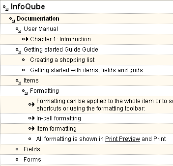
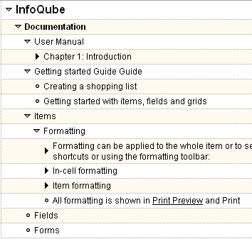
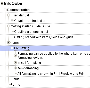
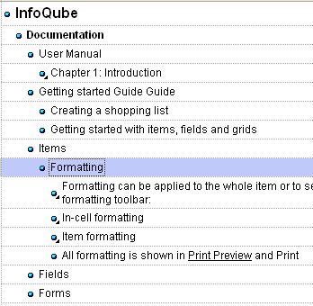
One thing I like about this community website is the outline under IQ Community (left collapsible menu). Simple and aesthetic. Also, there are 3 icons:
- Item closed
- Item opened
- Item has no subs
I found a way to also have 3 states (currently there are only 2 states) to the expand button / bullets. Here are 2 propositions. Any clear winner?
 |
 |
Compared with the current:
 |
 |
Also, as a bonus, I can now use the bullet for drag-drop, something Ecco users have been asking for. I personally really like the one on the top-right. Thoughts anyone?
Comments
For visual clarity the top right is a clear winner over top left. Top left doesn't add any extra value to justify the visual clutter.