Field Editor
Field-values are typically displayed in grids and in the Properties pane. To make changes, customizable editors are possible, depending on field type:
- Yes / No fields show a check box by default. To change the images displayed for both checked and un-checked states, modify the CheckOn.ico and CheckOff.ico files (located in the AppFiles folder)
- Text fields show a text box with or without a mask. A pop-up list of suggested values is also possible (single or multi-select types)
- Number fields show a text box with up/down spin buttons. A pop-up list of suggested values is also possible
- Date fields show a text box with a dropdown button to show a mini-calendar and options to show the item in the Calendar
Choosing the Editor Type
For Text and Number field types, the editor type can chosen for each field. The following editor types are available:
- Text box
- Text box with mask
- Fixed list pop-up
- List of items pop-up
- Auto-list of values
- Advanced Mode
In the Field Properties dialog, select the field in the field list and open the Editor section:
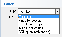
Multi-Select pop-up list
Of these editor types, 2 support multiple selections:
- List of items pop-up
- Auto-list of values
See Multi-select Pop-up Lists for details
1. Text box
This is the default field editor. It is a standard text box supporting cut / copy / paste / select all / undo (through menu commands, right-click context menus and keyboard shortcuts)
2. Text box with mask
For text fields, it is possible to use of a mask:

The input mask limits the amount and type of information that can be entered in a field.
For example, a telephone field could contain (###) ###-#### as the input mask
This field would then show (___) ___-____ and would only allow number entry
Here's the list of all rules and masking characters:
- # (Digit), Masks a digit character. [0-9]
- x (Hexa Lower), Masks a lower hexa character. [0-9],[a-f]
- X (Hexa Upper), Masks a upper hexa character. [0-9],[A-F]
- A (AlphaNumeric), Masks a letter or a digit. [0-9], [a-z], [A-Z]
- ? (Alphabetic), Masks a letter. [a-z],[A-Z]
- < (Alphabetic Lower), Masks a lower letter. [a-z]
- > (Alphabetic Upper), Masks an upper letter. [A-Z]
- * (Any), Mask any combination of characters.
- \ (Literal Escape), Displays any masking characters. The following combinations are valid: \#,\x,\X,\A,\?,\<,\>,\\,\{,\[
- {nMin,nMax} (Range), Masks a number in a range. The nMin and nMax values should be numbers. For instance the mask {0,255} will mask any number between 0 and 255.
- [...] (Alternative), Masks any characters that are contained by brackets []. For instance, the [abcA-C] mask any character: a,b,c,A,B,C
3. Fixed list pop-up
The fixed list pop-up is a simple pop-up editor that allows selection of a single value from a list (multi-select not possible)
Enter the list of suggested values, separated by the vertical bar ( | ). To edit large lists, double-click or press F2 to open the pop-up editor (which can be resized)
The advantage of this editor w.r.t. other pop-up types is faster to select from the list, in particular if "Entry must be in list" is checked
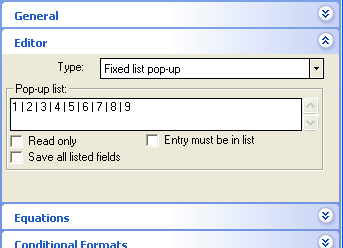
Gives:

4. List of items pop-up
The pop-up list comes from the values in the IQBase. It can be from a field used for just that (text, date, number) or a more generic field (i.e. Item, notes, etc) filtered.
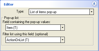
When selecting this option, you'll see:
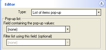
You have 2 options for this list. Of the two options, #2 is easier:
- Option 1: Field dedicated to this popup:
- Create a new Text field. ex ActionOnList
- Add values (one easy way is to double-click on the new field in the properties pane
- In the editor of the field which which will show the popup (e.g. ActionOn), select this new field from the list (e.g. ActionOnList)
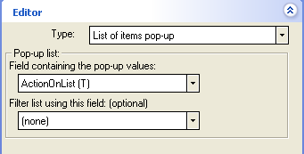
- Option 2: Filtered generic field:
- The easiest way to do this is to create a new grid, such as ActionOnList and simply enter the list in the new grid.
- In the editor of the field which which will show the popup (e.g. ActionOn), select "Item" for the field and "ActionOnList" for the filter
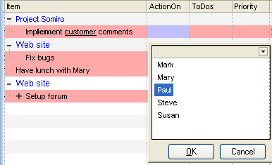
Either way will result in a pop-up list :
5. Auto-list of values
This pop-up list type is the easiest to setup. It shows an standard edit box and a button to bring up the list of values previously entered in this field: 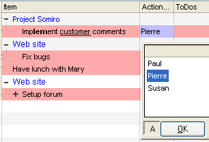

The "A" button (A stands for "All", button is at the bottom-left) toggles from 2 possible lists:
- List of all field values in the database (i.e. all distinct values for this field)
- List of all field values of items in the current grid
6. Advanced Mode
Through SQL queries, advanced pop-up editors can be created. Examples are:
- Multi-column pop-up lists
- List from another database (IQBase, Access, etc)
6.1 Multi-column pop-up lists
Using SQL queries, you can have a pop-up list showing more than one column. If "Save all listed fields" is checked (see image in section 3. above), the pop-up list can save all columns. For example, if you want to see both the contact name and telephone number:
- Select SQL query (advanced) for the edit type
- In Pop-up list, enter:
Select Item as MyContacts, Tel from AdrsBook ORDER BY left(Item,100) - Check "Save all listed fields"
- Click Save and Close
- The pop-up list will now look as such:
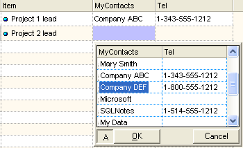
- Selecting an item in this list will assign values to both fields (MyContacts and Tel)
- To know what values to copy in which field, the pop-up column name must match the column name of the grid (in this case, the column names are MyContact and Tel)
- Notice that to sort on a text field, one must add a function to retrieve a portion of the text field ( < 255 chrs) (see ORDER BY clause above)
6.2 List from another database
The SELECT clause can be quite complex and data can come from any other ODBC-enabled database (IQBase, MS Access, SQL Server, MySQL, SQLite, etc).
The only requirements for this multiple assignment is that the resulting column names (as seen in the pop-up list) be the same as field names in your IQBase.
A forum thread discusses how to use pop-up lists: [How do I] Pop Up Lists