Using Grid Columns and Column Sets
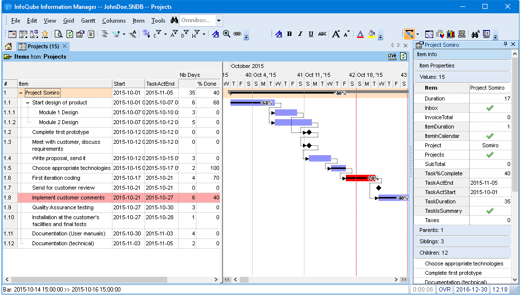
When an item is selected, in any of InfoQube's views, the properties pane can be used to view / edit item values and properties. It shows the information for the selected item.
One advantage of a grid, is that it can show columns which can be used to display and edit item values.
The Column menu (or right-click on a column header) contains commands to work effectively with columns:
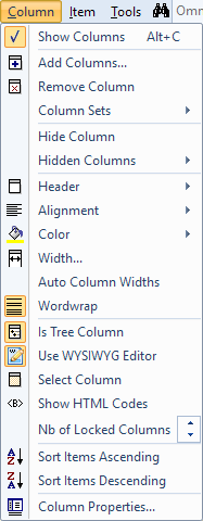
1- Column menu commands
- Show Columns: Toggles the display of columns. When turned off, only the Tree column is show. Ideal when you want to focus on entering text in the outline
- Add Columns: Shows a dialog where you can add and remove fields shown in the grid columns.
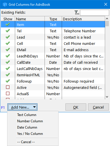
- Current grid columns are shown first, followed by an alphabetical list of all fields
- Click Add New to show a column based on a new field
- Tabular list supports auto-search, sorting and filtering
- By default, only one field can be selected. Right-click to enable multi-select
- Drag-drop to reposition columns in the grid
- Hint: To add a column to a grid, you can also drag-drop a field to the grid, from:
- Properties pane
- Field Management dialog
- Remove Column: Removes the current column(s) from the grid. Supports multiple column selection
- Column Sets: See below for details
- Hide Column: Hides the current column(s) from the grid. Supports multiple column selection. A hidden column is still part of the grid, but not displayed. It can still be used to sort, filter and parameter in conditional formatting. To show a hidden column, use the Hidden Columns command (below)
- Hidden Columns: Shows the list of currently hidden columns :

Select a column in the list to un-hide it or "Show all Hidden Columns" to un-hide all
- Column Header: Change the following column header properties :
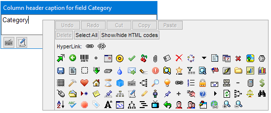
- Caption: Change the header caption. Headers can be rich-text formatted (bold, etc) and icons inserted anywhere in the text. (uses the Popup Editor):
- Alignment: Change the column header text alignment (left, centered, right)
- Move Left / Right: Move the current column(s) left or right. Supports multiple column selection. Drag-drop can also be used to change the order of columns in a grid.
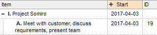
- Move the header Up / Down: Grids support multiple levels for headers. This is particularly useful for checkbox columns or columns with long captions :
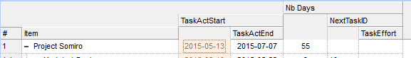
- Group Columns: Select 2 or more columns to group them. Column groups have a + expand / collapse button:
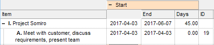
(on the left, the column group is collapsed, hiding the End and Days columns)
If a column is grouped, the Group Column command button will be checked. Uncheck it to ungroup
- Ungroup All: Ungroups all grid columns
- Multiline Header Text: Header text can word wrap (up to 3 lines high) if the following 3 conditions are met:
- Grid > Properties > Options > Multiline column headers is checked
- All columns are at the same level (i.e. Header Up was not used to stack headers)
- Columns are not grouped (use Column > Header > Ungroup All)
- Caption: Change the header caption. Headers can be rich-text formatted (bold, etc) and icons inserted anywhere in the text. (uses the Popup Editor):
- Alignment > Left / Center / Right: Sets the alignment for values in this column. This effectively sets the field alignment (Field > Properties), so any change is reflected in all other grids. Supports multiple column selection.
- Color: Sets the Field color. The field color is shown on the column header and / or the column cells. Setting in Tools > Options > General > Grids. Supports multiple column selection.
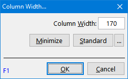
- Width...: Sets the width of selected column(s). Shows the Column Width dialog:
- Auto Column Widths: When set, the grid will adjust the column widths to fill the available horizontal space
- Wordwrap: Toggles word wrap for text and dates columns. Setting is grid specific, so for the same field, grids can have a different setting
- Is Tree Column: Normally, the Item column is used to show the outline. InfoQube however lets you choose any other column.
- Use WYSIWYG Editor: For text columns, toggles the use of the WYSIWYG editor.
- Select Column: Selects the current column
- Show HTML Codes: InfoQube supports HTML-based rich text formatting.
Normally, these are shown in a WYSIWYG way, so codes are hidden, but sometimes it is useful to see the actual formatting codes.
Use this command in such situations. If the WYSIWYG editor is turned off (see below), you can see the codes when editing. Another way is to use the pop-up editor which can also show HTML codes.
- Nb of locked columns: Sets the number of locked columns. Locked columns do not scroll when grids are scrolled left and right.
To lock columns, place these on the left of grid and select one or more locked columns. Particularly useful for grids that have many visible columns.
- Sort items ascending / descending: Use this command to sort items / sub-items
- Column Properties...: Displays the Manage Fields dialog. Use this to make changes to fields. Details here
2- Using Column Sets
Each grid has a set of columns, which are typically chosen to best describe the items in the grid. Sometimes however, one wants to see other item values. The Properties pane can be used for this but as an alternative, it is also possible to load / unload column sets.
This allow a dynamic grid display with easily interchangeable sets of columns. Grid native columns are still available (for sorting and conditional formatting purposes), but made invisible, except for locked and tree columns (which remain visible, no matter what).
Column sets can come from forms or grids. To learn more about forms, see this page. By default, grids are not shown in the Properties pane, to show a specific grid, use Manage grids > Options > Show this grid in the Properties pane.
2.1 Loading a Column Set
Use Columns > Column Sets to switch column sets:
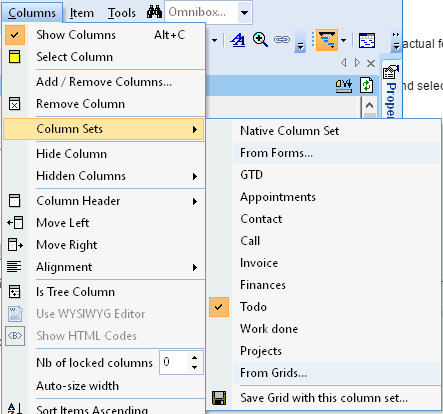
The columns in the grid will instantly change:
2.2 Unloading a Column Set
To unload a column set, do one of:
- Select Native Column Set
- Close the grid
2.3 Saving a Column Set
After loading a column set you can set the grid to use it by default. To do so, do one of:
- Click Save Grid with this column set...
- Click Grid > Save
Either way, a dialog will be shown:
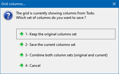
- Saves the grid with the native columns (i.e. before the column set command was used)
- Saves the grid with columns as displayed. The native columns will be removed (except hidden columns, those stay hidden)
- Combines both sets of column. The native columns which were invisible (after a column set command) will become hidden columns. Use Columns > Hidden Columns to show these
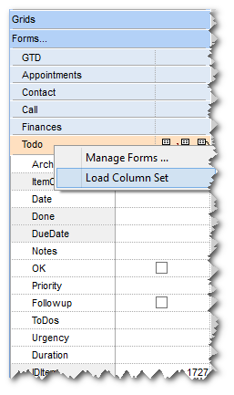
2.4 Using the Properties pane to load column sets
Column sets can also be loaded / unloaded using the Properties pane
To load a column set, you can
- Drag-drop a form to a grid, or
- Right-click on the form or grid in the Properties pane:
Hints:
- You can keep some of the grid's native column if so desired. Simply lock then before loading the column set (see below on how to lock columns).
- To restore the native grid columns, right-click on the column set (or the Current Grid entry under the Grid heading) and select "Unload Column Set".
- Multiple uses, but in particular, when viewing items in the search or scratch grid, users can then load column sets to view pertinent information.