Manage Grids Dialog
The Manage grids dialog is used to view / edit / delete grids.
To open the dialog, you can:
- Use Tools > Manage Grids...
- Right-click on a workspace tab and select Manage Grids...
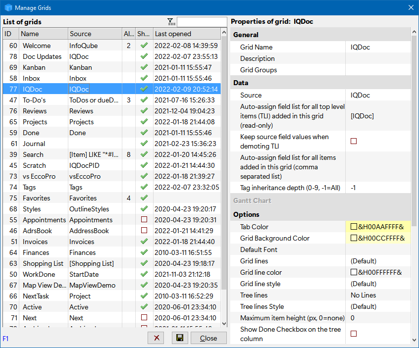
The dialog is divided into left and right panes:
1. The Left Pane
Left pane shows the list of grids, also shown are:
- The grid source (i.e. which items are shown in this grid)
- Keyboard shortcut key (Alt + number)
- Whether to show or not the grid in the NavBar
- Date the grid was last opened
- Grid ID, a unique number identifying the grid
The tabular list allows auto-search, sort and filtering of the list:
- Auto-search: In the Name or Source columns, start typing to find a grid
- Sort: Click any column header to sort
- Filter: Click on the column header filter button to filter the list of grids shown
(e.g. to filter out system fields, enter ">200" in the ID column header fitler) - Drag-drop grids from one position to another
Right-click on items in this list to:
- Create a new grid
- View the selected grid (i.e. open the grid)
- Copy the grid. Once copied, you can:
- Paste it as a pane (dashboard-type grids)
- Paste the grid format, from one grid to another
- Paste hyperlinks to grids
- View the list of columns
- Save the list of columns as a form (see 4. Forms)
- Delete the selected grid
- Save the order of grids
The left pane support multiple selections. This is useful to
- Open multiple grids at once
- Delete multiple grids
- Copy multiple grids. In a grid, do Edit > Paste Special > IQ View to create items that will be hyperlinks to grids
At the top there is a Filter button and text box. Enter text to field list. Shortcuts are Ctrl+F and Ctrl+G
2. The Right Pane
The right pane shows the properties of the selected grid (left pane).
The pane is divided into the following sections:
- General
- Data
- Gantt Chart
- Options
2.1 General
- Grid name: 50 characters max. All characters are valid except " . | ~ * ! ` ? [ ] . Cannot start with a number
- Description: 255 characters max.
- Groups: Enter the list of groups this grid belongs to (comma separated). See 7. Grid Groups for details. The NavBar provides an easy way to manage grid groups
2.2 Data
- Source: Field or SQL defining the items to show in the grid
- Auto-assign field/Tag list for all top level items: Based on the grid source, this give the (read-only) list of fields and tags that will be automatically assigned a value for all new Top Level Items (TLI) created in this grid
- Keep source field values when dragging out or demoting TLI: When an item is moved from a TLI to another grid or to be a sub-item, should the source field value be kept or not:
- If the grid source is complex, source field value is always kept
- If the grid where the item was dropped also have that field as a source, the value is kept
- If Ctrl key is held when dropping, the value is also kept
- If all of the above are false, the action depends on the source field type:
- Date: Always keep
- Number: Delete value if 0 or equal to the default value
- Text: Delete value if " " or equal to the default value
- Y/N: Always delete
- Auto-assign field list for all items added in this grid: Comma separated list of fields. All items created in this grid will have a value for these fields
- Tag inheritance Depth (0-9, -1=All): When tags are used in grid source and/or filter, sets the tag inheritance depth. See 3. Tags
Defining the Grid Source
Together, the Grid Source and the various filters specify what items are shown in the grid. Items displayed in the grid will be those that meet both the Source and the filters. See 2. Filtering for detailed information on filtering. The following helps understand how grids determine what items are shown:
- When a Grid is first created its Source is set to be the field that matches the Grid's name (unless specified otherwise in the New Grid dialog)
- When the Source has only one field then any new top-level-items created in the Grid will automatically have a value for this field. The grid is said to have a "Simple Source"
- If the source field name(s) contains spaces or other special characters, it needs to be enclosed with [ ]
- Source and Filter are kept separate so you can keep the Source constant as you tweak the Filter. Also, the Filter can be turned On / Off which is not the case for the Source
Sample Grid Sources
- [Address Book]: All items with the field Address Book checked
- [Address Book] AND Archived is Null: Shows un-archived contacts
- Project = "Somiro": All items that have the value "Somiro" in field Project
- Item like "*InfoQube*": All items with the text InfoQube somewhere in the item text
- More examples here: Source Filter Editbox
2.3 Gantt Chart
See Gantt Chart Properties for details
2.4 Options
- Tab Color: Color of the tab. Same as right-click on a Tab > Tab Color
- Grid Background Color: Overrides the setting in Tools > Options
- Default Font: Grids use the font specified in Tools > Options unless specified here. Format: Font Name | Font Size
- Grid Line Properties: A set of grid line settings. Overrides the same settings in Tools > Options
- Maximum item height: In pixels, 0=none
- Show Done Check Mark: Show / hides a checkbox on the tree column to mark items as done
- Show Hierarchy on the # column: If checked, the # column will show the item hierarchy (i.e. 1.3.2), otherwise a flat list of numbers
- Shortcut (Alt + ): Enter shortcut key. Valid is 1 through 9
- Multiline column headers: If checked, the grid header caption will word-wrap (up to 3 lines high, and only if columns are all at the same level and not grouped)
- Column(s) showing the text font/color: By default the item font is applied to all columns. Enter a comma separated list of fields to limit this (use # for the first column)
- Column(s) showing the item color: By default the item color (i.e. background color) is applied to all columns. Enter a comma separated list of fields to limit this (use # for the first column)
- Is the XXX grid: There are 3 special grids in InfoQube. Scratchpad, Search results and In-Box.
- Is a Dashboard-type grid: If checked, this grid is not shown, but only used as a container for other UIs. Grids, Surface-view, Card-view, Calendar, etc can be pasted to form a customizable layout of views, all shown in the same Dashboard. Details here: Dashboards
- Grid auto-updates: Grids auto-update is improving with every InfoQube version. Currently:
- Grids automatically update on item field values changes and on item deletion
- This flag only affects items added elsewhere (in another view or in another instance of this grid). If the flag is set and the new item meet the grid criteria, it will be added
- If auto-update is checked, the grid will also background load sub-items under collapsed items (when the display mode is Outline)
- Show in the Properties Pane: If checked, the grid and its columns will be listed in the Properties Pane, under the Grids heading.
With the grid columns visible in the Properties pane, it becomes like a form (see 4. Forms for details) - Grid visible to other applications: IQ uses Microsoft Jet 4.0 as its database engine. If this flag is set, a visible query will be generated which enables other applications, such as MS Word or Excel to view the items in the grid (read-only).
What these applications will see is however not the outline (since they do not support this), but rather the same list as the Grid > Display Mode > Flat List
3. Saving changes
Changes to grid parameters are buffered, so nothing is saved until you press the "Save" button. If you close the dialog without saving a dialog appears:
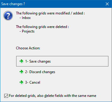
n.b. When grids are created, a matching field is often created and used as the source of items (i.e. determines what items are shown in the grid).
- If the bottom checkbox is checked, this field (i.e. the field with the same name as the grid) will be deleted. It will not be possible to re-create a similar grid with the same items (unless some other property is common to all those items)
- If the bottom checkbox is unchecked, the field will not be deleted. It is then possible (and easy) to re-create a new grid showing the same items as the deleted one